ok i’m no expert and to be quite honest i don’t even know what i’m doing most of the time BUT i’ll give u some tips based on how i draw + what i know from being a chubby person myself lol
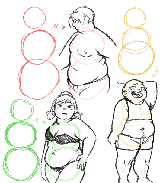
first of all: think circles
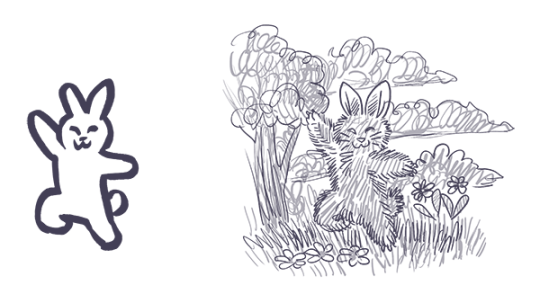
snowmen!!! the first one’s body is made up of 2 circles of the same size, indicating the chest and hips are gonna be the about the same size (an hourglass shape), while the one on the right has a smaller top and is gonna be a pear shape!!
now let’s sketch over these snowmen, keeping circles and soft shapes in mind the whole time!
and finally….
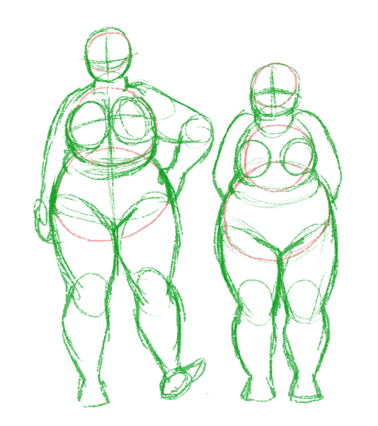
note the tummy rolls where the circles overlap!! fat will squish and bend all over the place, so if a person is stretching there won’t be tummy rolls, but when relaxing, the fat will roll up.
important to keep in mind: fat distribution varies a lot from person to person!! i reccommend googling nude fat people (not just plus models!!!) and studying how the fat is stored on people’s bodies and how it will move with the person!! (and if you happen to be a chubby person yourself, don’t be afraid to use a mirror!!)
fat people come in all shapes and sizes, so i couldn’t even BEGIN to try and draw every body shape there is!! so again, google is your friend. that said, here’s a few more snowmen turning into people:
the body isn’t the only thing to keep in mind, of course; the face is also super important!! a nice trick is to simply put less definition on the jawline; fat covers up bone structure!!
i just erased some lines and BOOM!! also, make the face rounder and fuller for those cute pinchable chubby cheeks!!
and of course, don’t forget about double chins!!
a lot of fat is stored around the neck so not only will you get double chins, but the back of the neck will also be chubby!! that’s a good thing to keep in mind when drawing short-haired or bald chubby people
another important detail: the arms!
fat mostly tends to gather in the upper arms but depending on the person the rest of the arm can also be noticeably chubby (for example, there will be less bone definiton around the wrist.) take note of the armpit area, where you’ll get folds!!
now for something i think is super important!!! stretchmarks!!
honestly, i think it’s so sad that there’s so much stigma around stretchmarks, because i think they’re wonderful!! they look like lightning bolts, or tiger stripes!!!
that said, stretchmarks are scars, so fresh marks will be reddish while older marks will fade and usually become a lighter tone than your skintone. they’ll appear wherever the skin stretches when you grow or gain weight, but here are the most common places to see them:
the upper arms
the chest/breasts
the underside of the tummy
the waist
the thighs (both inside and outside)
the butt
ok, i think that’s about it for tips i have to offer!! i’ll just repeat the most important tip of them all: don’t be afraid to google references!! references are your friend, it’s not cheating, every artist uses them and you will learn SO MUCH from them, trust me!!! and of course, practice practice PRACTICE!! figuring out how to draw different body types in your own style, especially if you’re used to drawing slimmer/skinnier people (and let’s face it, a lot of us started out drawing just one body type) takes time and practice, so just keep drawing!! 😀
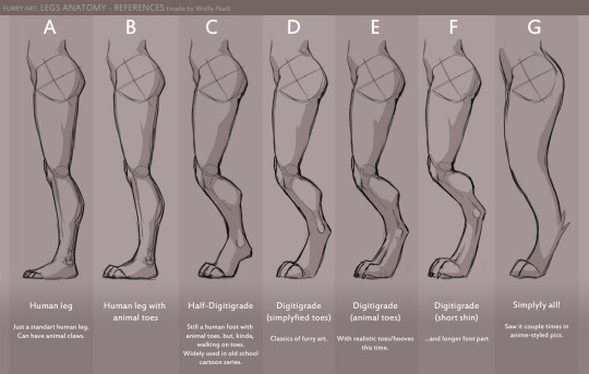
Finally revamped my ol’ realistic canine leg tutorial! The original is HERE
*PLEASE NOTE – this is a realistic, wild canine tutorial. Meaning if you prefer stylized anatomy feel free to ignore this tutorial. Also some of the do’s and don’ts here differ from domesticated canine anatomy.
Thank you to the Patrons who voted for this Tutorial! If you would like some bases to use freely for exercising your new knowledge, you can download them HERE.
If you would like to check out my reference Pile that I used for this tutorial, check that out HERE!
Hope this helped somehow in your journey to drawing plump and fat and chub folks c:
Have you ever felt like your art is on the same level for a long time? Have you ever felt like you can’t grow your skills. Have you ever felt like everyone around you grows in rapid speed and you are just like a snail at the end of the race?
I was thinking about that and trying to pinpoint the reasons why you might feel that way. I figured out some solutions that helped me and some other artists I know.
1. Not looking for critique/feedback
‘You can’t yourself pinpoint things you need to focus on because your eye still isn’t trained enough to pinpoint exact problems.’
This is number one problem I see and many professional artists will tell you about that. You can’t be too shy to show your work to people who can give you good critique. Look for professionals who are willing to help you and use that. Critiquing is mistaken to be something hurtful for young artists BUT in reality people giving feedback are trying to help you grow. I know how hard it is to hear that you are still not good enough, that your art is lacking something. Maybe you know that yourself but you can’t yourself pinpoint things you need to focus on because your eye still isn’t trained enough to pinpoint exact problems. The best person to go to would be professional with trained eyes who is able to say by flipping through your portfolio what it lacks and what you can do to make it look better. Don’t be afraid and seek that help. Don’t be too attached to your own art and accept that it isn’t perfect and you need a fresh pair of eyes to look at it.
2. Not implementing the feedback
‘Implementing is the key step in the process of growing.’
After you have done first step from my list and you finally found a professional willing to give you feedback try to implement feedback. Don’t just listen to it, nod few times pretending you understand what it being said. Don’t defend your art and don’t give excuses if the critique is genuine. Implementing is the key step in the process of growing. There is no use in feedback without you actually trying out the tips you were given. The whole point of that is to change your work. You are not being better artists by collecting thoughts about your art. Now it is time to do the work. It actually requires to put time and effort . Usually what people do,after receiving feedback, is they pat themselves on back like it was ‘job well done’ and being lazy. They are not willing to actually put in the work to implement feedback. It is time consuming and you need to put a lot of effort. Although without that there is not any point in seeking feedback.
3. Not trying/not failing enough
‘Embrace failures as a valuable lessons.’
Yes! There is lesson in failure! As hard as it is to understand. Once you collect experience you grow from it and become wiser. You know what path to choose to avoid next time failure. Successful people are the ones that can try something many times before they finally succeed. When they finally succeed it’s just a result of many attempts they have made before. No one is born ready for challenge. People are scared to lose because for our psyche it hurts more than a win feels good. People will try avoid at any cost losing so at some point they give up and stop trying. You can’t say for sure you will be successful artist after you did it for a year and don’t see result. You are not the one deciding how long it takes. It will be done some day. some day you will meet your artistic goals. But you will only meet them by trying and failing probably hundred times on a way. Just don’t be afraid. Those mistakes on a way are path that differentiate you and a professional. They already failed many times to get to where they are now. When you understand that you will embrace failures as a valuable lessons.
4. Doing things that are not challenging you.
‘Feel uncomfortable and pick up this damn pencil and draw like no one else is watching!’
Don’t settle in your comfort zone. You’ve heard that already many times right? That is why. You limit your skillset. Good things come out of comfort zone. If you feel like you have problems drawing something you are probably right. The reason is you don’t challenge yourself enough to draw things that are difficult for you. For example if you are only drawing a boy in front view standing with hands straight it doesn’t sound like the most exciting art right? But what if it’s the only thing you can draw and it looks somewhat decent? Well then, solution for that is easy – experiment with different angles, experiment with expressions, with composition, with different species. Be brave here and discover topics you don’t draw. You art will become more interesting and you will be more confident drawing. Personally I know that this is the hardest part for artists. It is hard to let go of what we know and discover unknown. We feel vulnerable and like we can’t really draw. This feeling sucks. As much as this feeling sucks you know what else sucks? Sucks that your skills are stagnating. Feel uncomfortable and pick up this damn pencil and draw like no one else is watching! I guarantee that after some time you will be surprised with what you created and how your art have changed.
Good luck to everyone who is on path of improvement!
I frequently see artists complain that their finished works got less attention than mere sketches, doodles and other smaller or less serious work. Which is frustrating! But almost as often, I can see exactly why the doodle got more attention. I’m going to cover some of these reasons, so you can use that information so you can do more than fume about it.
The doodle is easy to read, the polished work is busy
The polished work is completely drenched in little details that the artist slaved over, but the details create a kind of overall noise that makes everything harder to understand, making the whole image less appealing.
Don’t get too lost in little details, work from larger shapes to small details, use things like a highly readable silhouette, contrast, variance in line width or negative space to keep the image understandable. Pay attention to the composition to guide the eye where you want it.
The doodle is high contrast, the polished work is low contrast
When you do lots of details all equally well lit and easy to see, overall you lose the strong lights and darks that make a work pop. You have to sacrifice some of those details, let them be in shadow or out of focus in the background, to create a more appealing image overall.
You might also be forgetting that without lineart you need to use strong lights and darks, since lineart creates it’s own natural high contrast.
Contrast draws the eye, use that to create focus where you want it.
The doodle is simple to understand, the polished work is highly ambiguous in meaning and message
Many doodles that outstrip the artist’s polished work are jokes. Jokes usually have a specific clear focus and message, the viewer can understand it immediately (if they couldn’t, it wouldn’t be funny). You don’t have to make everything funny, but like a joke, you need to get to the point and give the audience the information they need to “get it.” More details can be present, but the viewer should not be confused about what to look at from the outset. Remember: people will look at and interpret your art in milliseconds. They might give it a longer look but only AFTER that millisecond look.
The initial glance is like the first page of a book. If it wows them they keep looking to understand more, if they are lost and confused, no second chances, they’ve already scrolled away.
You can use things like composition, basic structures of shapes and simple shape symbolism to give viewers the initial information they need to stay interested. Don’t feel like you have to abandon more personal and difficult to parse symbolism, these things can work together to create intrigue.
The doodle is fluid and expressive, the polished work is stiff and dead
The sketch for your polished work needs to be done with spontaneity and fluidity. When you want to really flex your drawing skills and show the world your beautiful realistic human faces, your sublime anatomy, gorgeous textures – it’s easy to forget about the undersketch and jump to rendering as soon as you can, creating a stiff or boring sketch that isn’t worthy of all the time you’re sinking into the minute details.
Practice quick gestures, read up on line of action, and before you make a polished painting, make sure you have a sketch that’s fun to look at even without the detailed rendering. Thumbnailing helps. Studies too. Sometimes you have to do the bad boring sketch, but you can take a few stabs at it.
You can’t make a bad sketch good by painting more details on it, you need to work out the sketch first before moving to the details.
Remember, if you’re going to spend 20 hours painting the thing, you can afford another half hour sketching a few different takes on your idea before digging in.
Lots of doodles, very few polished works
If you mostly post one kind of thing, your audience will be people who like that. Also, you may not have much practice with the techniques you are using in the polished work, while you have become a pro at doodles. You become an expert at what you practice, do more of what you want to be known for, become an expert at it, make it the only thing your audience is there for.
The audience is familiar with the subject of the doodle, unfamiliar with the subject of the polished work
Many artists do doodles of fanart and get fed up that people like that more, but the truth is, they don’t like it “more” they just already know they like it. You can increase the chances of people appreciating your original works by making sure they can understand what’s going on in the illustration without prior knowledge of who these characters are, or simply sticking to it until you have garnered an audience. Just keep at it.
Remember, the creators of the property you made fanart of are themselves artists who were pushing an original idea at one time. You can follow in their footsteps.
The doodle is quirky and unusual, the polished work is stale and samey
This can happen when an artist has an image in their head of what a SERIOUS and PROFESSIONAL painting looks like, usually based on a very narrow subset of artwork, often itself based on the same cargo cult of seriousness.
Try studying works outside your usual stomping grounds. Look to artists that likely inspired your faves (if you’re talking about realistic artists who inspired your favorite concept artists, here’s some likely culprits to get you started on the google search: JC Leyendecker, Alphonse Mucha, Norman Rockwell, James Gurney, Rembrandt), look to artists outside your genre, and look at your doodles and ask yourself what “not serious, just for fun” source of inspiration is making them so fresh and vibrant that your audience is connecting to them so strongly. Study that, respect that fun and try to pull it into your serious work.
The polished work was hard to make and no one cares
Being an artist is hard, and that we keep at it is commendable, but struggling and taking more hours doesn’t make a piece better necessarily.
There are a few things to consider here. First, you need to realize looking to the vague faceless masses of the internet for a fatherly “I’m proud of you, son” moment is always going to be disappointing and painful and attempting to guilt strangers into fulfilling that role for you is awkward and inappropriate. You need artist friends who can recognize your hard work and cheer you on and you need to be your own cheerleader, value your own hard work and practice.
Second, you need to realize torturing yourself doesn’t in and of itself make art better. Hard work is something people love about art, the meaning of someone spending that time, but if I screamed for 8 hours, drew a single line, then posted that, the internet wouldn’t be wrong to be unexcited about it. Rather than blame the viewer, think about two things: how can you make the art itself more appealing while still doing the painting that you’re interested in doing, and how can you do that faster and with less pointless suffering?
It’s okay to be a masochist when it comes to art, many artists are, just make sure you’re spending your time and suffering wisely.
You’re complaining about someone else’s “doodle”
Sketches and cartoons are deceptively hard to make appealing, rather than fume that they are getting more attention, look to them for lessons. What could you learn from them? Could you do it? Maybe you should try. Would make a good exercise.
And never get mad that their drawings are more appealing to the internet than yours, even though they spent less time on their drawing than you did on yours. See above for why time is not important here, but also keep in mind they may have been practicing longer than you or may be more established than you.
Keep working on your art, keep posting, push to be seen, advertise your work, put yourself out there. These things take time but work.
A compilation of stuff I know about drawing Asian faces and Asian culture! I feel like many “How-To-Draw” tutorials often default to European faces and are not really helpful when drawing people of other races. So I thought I’d put this together in case anyone is interested! Feel free to share this guide and shoot me questions if you have any! I’m by no means an expert, I just know a few things from drawing experience and from my own cultural background.
Hello friends, this is the long awaited tutorial on Line-Quality, Art-Style, and Same-Face-Syndrome.
Line-Quality is improved by building Muscle-Memory.
You build muscle memory through Drawing-Exercises.
Art-Style is developed over time through Observation and Routine.
Routines such as… Drawing-Exercises.
And now for… the Ultimate Drawing-Exercise-Routine!
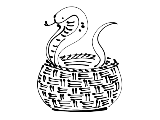
It’s called Snake-In-A-Basket!!
Draw any kind of snake inside of any kind of basket. You have 5 to 20 minutes to complete it before each/every Big-Serious-Illustration to tackle. No more, no less time!
Draw it… NOW!
(my example that I drew in GIMP)
Art-Style is not necessarily what you think it is. A fairly common style issue discussed in artist circles is the inability to draw the same character twice while retaining their likeness or the lack of uniqueness which makes our art (recognizable) distinguishable from another’s “oh! YOU drew this!”.
Here are the fastest pathways to attaining the elusive Art-Style:
Repetition!!!!!
Recurrence-of-Thematic-Elements (everyone is sad, robots, someone is always shirtless, etc)
Same Color-Palette used for everything you draw
Same-Tools (line width, brush set, same paper, canvas size)
or Same-Program
(examples of palettes!! you can’t go wrong with having a rainbow)
Some Amount of Explanation:
If you draw on the same size or same scale (A6, A5, A4, A3 | B6, B5 | Letter) or in the same orientation (Landscape or Portrait), it helps you learn Composition intuitively by training you to make use of the space you have. Also it’s easier to print out and frame if you draw on common photo print sizes 4×6, 8×10, etc.
Even if you make a lot of use of Blend/Blur and you’re more of a Painter than a Cel-Shader– deciding to use a Set Personal-Default-Color-Palette instead of randomly choosing them on the Wheel/Triangle-Thing will still give you enough stable consistency.
Onto the next thing!
Same-Face-Syndrome is normally caused by one of two things. If it’s not one then it’s the other: Same Shapes or Same Details.
To make noticebly different characters you have to Exaggerate.
Before you try your hand at drawing any Face or Body Type, draw another Snake-In-A-Basket first.
You think I’m joking?
No. I’m not.
So to wrap up, you need to Warm Up to draw, you need to make a color palette and stick to it –or just use the same Crayola pencils, or the same kind of Bic pen, same kind of sharpie, .7 or .5, and have themes like “plaid flannels for everybody” or “hoodies and jeans”. Find those things you can execute consistently, like hatching or stippling, and if you like it, stick with it!
Hope this helps!
Now draw a SNAKE-IN-A-BASKET!
Why the snake in a basket though?
This is the alternative looks a bit more abstract. The Snake-In-A-Basket makes use of different lines going in different directions but in one visually comprehensive Object. Its purpose is to build confidence in making long, medium, short lines.